Master Your Wardrobe: Color Theory for Stylish Mixing and Matching
Welcome, fashion enthusiasts and style seekers! In the ever-evolving world of fashion, one fundamental principle remains timeless: color theory. Understanding how colors interact, complement, and contrast can transform your wardrobe from a collection of individual pieces into a symphony of stylish ensembles. This comprehensive guide, specifically tailored for 2026, will demystify wardrobe color theory, empowering you to mix and match with confidence and flair. Forget fashion dilemmas; it’s time to unlock your inner stylist!
Whether you’re aiming for a sophisticated professional look, a vibrant casual statement, or an elegant evening outfit, mastering wardrobe color theory is your secret weapon. We’ll delve into the core concepts, explore three essential color palettes, and provide actionable tips to help you curate a wardrobe that truly reflects your personal style and makes you feel incredible every single day.
So, grab a cup of coffee, open your closet, and prepare to see your clothes in a whole new light. By the end of this article, you’ll be equipped with the knowledge to create countless stunning outfits, ensuring you’re always dressed to impress, no matter the occasion.
The Foundation of Fashion: Understanding Wardrobe Color Theory
Before we dive into specific palettes, let’s establish a solid understanding of wardrobe color theory. It’s not just about what colors look good together; it’s about understanding the psychology, impact, and relationships between different hues. Think of color theory as the blueprint for building a cohesive and captivating wardrobe.
Advertisements
The Color Wheel: Your Ultimate Styling Tool
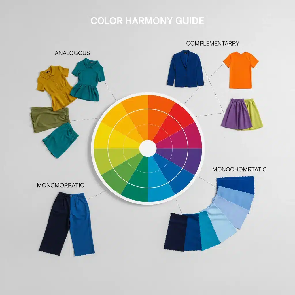
At the heart of wardrobe color theory is the color wheel. This circular diagram illustrates the relationships between primary, secondary, and tertiary colors. Familiarizing yourself with it is the first step to becoming a color-mixing maestro.
- Primary Colors: Red, blue, and yellow. These are the foundational colors from which all other colors are derived.
- Secondary Colors: Green, orange, and purple. Created by mixing two primary colors.
- Tertiary Colors: Red-orange, yellow-orange, yellow-green, blue-green, blue-violet, and red-violet. Formed by mixing a primary and a secondary color.
Key Color Harmonies for Your Wardrobe
Understanding these harmonies will unlock endless possibilities for your outfits:
- Monochromatic: Using different shades, tints, and tones of a single color. Think various shades of blue, from navy to sky blue. This creates a sleek, sophisticated, and elongating effect. It’s a fantastic starting point for anyone new to wardrobe color theory.
- Analogous: Combining colors that are next to each other on the color wheel. For example, blue, blue-green, and green. This creates a harmonious, pleasing, and often serene look. It’s less stark than complementary schemes but offers more depth than monochromatic.
- Complementary: Pairing colors directly opposite each other on the color wheel, such as red and green, or blue and orange. These combinations create high contrast and vibrancy, making a bold statement. While powerful, they require careful balancing to avoid looking jarring.
- Triadic: Using three colors evenly spaced around the color wheel, like red, yellow, and blue. This creates a vibrant and balanced look, often found in artistic and playful styles. It’s a more advanced technique in wardrobe color theory but incredibly rewarding.
- Split-Complementary: A variation of the complementary scheme, using a base color and the two colors adjacent to its complement. For example, blue with yellow-orange and red-orange. This offers a high-contrast look that is less intense than a direct complementary pairing.
By grasping these fundamental concepts of wardrobe color theory, you’re already on your way to becoming a more confident and creative dresser. It’s about more than just matching; it’s about creating a mood, telling a story, and expressing your unique personality through your clothing choices.
Palette 1: The Timeless Neutrals – Building Your Wardrobe Foundation
Every well-curated wardrobe, regardless of personal style, benefits from a strong foundation of neutrals. These are the workhorses of your closet, providing versatility and elegance. When discussing wardrobe color theory, neutrals are often overlooked but are absolutely essential.
Defining Neutrals in Fashion
Neutrals include colors like black, white, gray, beige, brown, and navy. They are incredibly versatile because they don’t compete with other colors; instead, they allow other hues to shine or create a sophisticated, understated look on their own. In 2026, we see a continued appreciation for high-quality, well-fitting neutral pieces as the cornerstone of a sustainable and functional wardrobe.
Why Neutrals are Crucial for Mixing and Matching
- Versatility: Neutrals pair effortlessly with virtually any color, making them ideal for building countless outfits. A simple white t-shirt or a navy blazer can be styled in dozens of ways.
- Sophistication: Head-to-toe neutral outfits exude an air of understated elegance and luxury. Think monochrome beige or an all-gray ensemble.
- Grounding Effect: When paired with bolder colors, neutrals provide a grounding effect, preventing an outfit from looking too busy or overwhelming. They allow vibrant pieces to pop without clashing.
- Longevity: Neutral pieces rarely go out of style, making them excellent investments for a long-lasting wardrobe. This aligns perfectly with the growing trend of conscious consumption in 2026 fashion.
Tips for Styling with Neutrals
- Play with Texture: To add interest to an all-neutral outfit, incorporate different textures. A chunky knit sweater with silk trousers, or a linen blazer with cotton pants, creates depth without introducing new colors.
- Vary Shades: Instead of wearing the exact same shade of a neutral, mix different tones. A light gray top with charcoal gray trousers creates a sophisticated monochromatic look.
- Introduce a Pop of Color: Use accessories like a brightly colored scarf, handbag, or shoes to add personality to a neutral base. This is an easy way to experiment with wardrobe color theory without committing to a full colorful garment.
- Layering: Neutrals are perfect for layering. A white shirt under a beige cardigan under a navy coat creates a polished and warm look.
Embracing the power of neutrals is not about being boring; it’s about building a smart, adaptable, and chic wardrobe foundation. They are the unsung heroes of wardrobe color theory, providing the canvas upon which all other colors can truly shine.
Palette 2: Vibrant Hues – Adding Personality and Impact
Once your neutral foundation is solid, it’s time to inject some personality with vibrant hues. This is where wardrobe color theory becomes truly exciting, allowing you to express your mood, make a statement, and embrace the joy of color.
Choosing Your Signature Vibrant Colors
The key here is to select colors that not only appeal to you but also flatter your skin tone and hair color. While personal preference is paramount, a quick search for ‘color analysis for skin tone’ can offer valuable insights. In 2026, we’re seeing a trend towards bold, saturated colors like emerald green, cobalt blue, fuchsia, and sunny yellow.
Strategies for Integrating Vibrant Colors
- One Statement Piece: The easiest way to incorporate vibrant colors is to choose one key item – a dress, a blazer, or a pair of trousers – and pair it with neutrals. For example, a bright red dress with nude heels and a simple clutch.
- Color Blocking: This technique involves pairing two or more solid blocks of color together. It can be complementary (e.g., royal blue and orange) or analogous (e.g., fuchsia and red). The trick is to keep the silhouettes clean and accessories minimal to let the colors do the talking.
- Accessorize with Zest: If you’re hesitant to wear a full vibrant garment, start with accessories. A bright handbag, statement jewelry, or colorful shoes can add a powerful punch to an otherwise neutral outfit. This is a low-commitment way to experiment with wardrobe color theory.
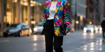
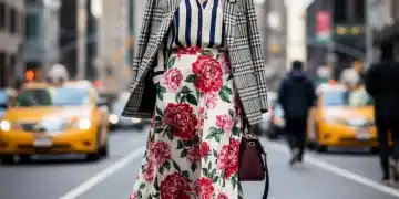
- Pattern Play: Incorporate vibrant colors through patterned garments. A floral dress with a mix of bold hues, or a striped top with contrasting brights, can be incredibly chic. Just ensure one color in the pattern can be picked up by a solid accessory or garment to tie the look together.
Balancing Brights with Wardrobe Color Theory
The secret to successfully wearing vibrant colors without looking like a rainbow gone wild lies in balance:
- Proportion: If you’re wearing a very bright top, balance it with more subdued bottoms, or vice-versa. A 70/30 or 60/40 split often works well.
- Tones and Shades: Not all brights are created equal. Some are more saturated, others more muted. Learn to distinguish between them and choose hues that work best for your desired impact.
- Consider the Occasion: While vibrant colors are fantastic for casual outings, parties, or creative environments, they might need to be toned down for more formal or conservative settings.
Embracing vibrant hues is about celebrating your individuality and having fun with fashion. With a little understanding of wardrobe color theory, you can confidently integrate these lively shades into your daily style, making a memorable impression wherever you go.
Palette 3: Sophisticated Pastels – Softness and Subtlety
Moving beyond the bold and the basic, we arrive at the sophisticated world of pastels. These soft, muted versions of vibrant colors offer an entirely different aesthetic, bringing an air of gentleness, elegance, and modern chic to your wardrobe. Incorporating pastels effectively is a nuanced aspect of wardrobe color theory.
The Allure of Pastels in 2026
Pastels, including shades like mint green, baby blue, lavender, blush pink, and pale yellow, have moved beyond seasonal trends to become a year-round staple. In 2026, we see pastels being used not just for spring, but also in heavier fabrics like wool and cashmere for winter, adding unexpected softness to colder weather ensembles.
How to Incorporate Pastels into Your Wardrobe
- Monochromatic Pastel: Just like with neutrals, a head-to-toe monochromatic pastel look can be incredibly chic and sophisticated. Imagine a full lavender suit or a blush pink dress with matching accessories. This demonstrates a refined understanding of wardrobe color theory.
- Mix with Neutrals: Pastels pair beautifully with neutrals. A pale blue shirt with white trousers, or a mint green sweater with beige pants, creates a fresh and clean aesthetic. Neutrals help ground the softness of pastels.
- Analogous Pastel Combinations: Combine pastels that are next to each other on the color wheel for a harmonious and subtle blend. Think a light blue top with a pale green skirt, or a soft peach blouse with a creamy yellow jacket.
- Subtle Contrast with Darker Hues: For a more modern and edgy look, pair pastels with deeper, richer colors. A delicate pink blouse under a charcoal gray blazer, or a pale yellow skirt with a navy knit, creates an interesting contrast that elevates the outfit.
Mastering Pastel Mixing and Matching
- Avoid Over-Sweetness: To prevent pastels from looking too childlike, balance them with structured silhouettes, sophisticated fabrics (like silk, satin, or tailored wool), and minimalist accessories.
- Play with Undertones: Pastels can have warm or cool undertones. Mixing warm pastels (peach, pale yellow) with other warm tones, or cool pastels (lavender, mint) with other cool tones, will create the most cohesive look.
- Layering Pastels: Use pastels for subtle layering. A pastel camisole under a sheer pastel blouse, or a light pastel cardigan over a darker pastel dress, adds depth without overwhelming.
- Pastel Accessories: If you’re new to pastels, start with accessories. A pastel handbag, shoes, or a delicate scarf can soften an outfit and add a touch of elegance.
Pastels offer a refreshing alternative to both neutrals and bold brights. They allow for a softer expression of style, perfect for creating looks that are gentle yet impactful. Understanding their place within wardrobe color theory opens up a realm of sophisticated styling possibilities.
Advanced Wardrobe Color Theory Techniques for 2026
Once you’re comfortable with the foundational palettes, you can begin to explore more advanced wardrobe color theory techniques. These methods will allow you to create truly unique and memorable outfits.
The Power of Tints, Tones, and Shades
- Tints: A color mixed with white (e.g., pink is a tint of red).
- Tones: A color mixed with gray (e.g., dusty rose is a tone of red).
- Shades: A color mixed with black (e.g., burgundy is a shade of red).
By understanding these variations, you can create outfits that are monochromatic but incredibly rich and deep, playing with different values of the same hue. This adds sophistication and visual interest without introducing new colors, a subtle yet powerful aspect of wardrobe color theory.
Incorporating Prints and Patterns
Prints and patterns can be daunting, but with wardrobe color theory, they become opportunities for creativity:
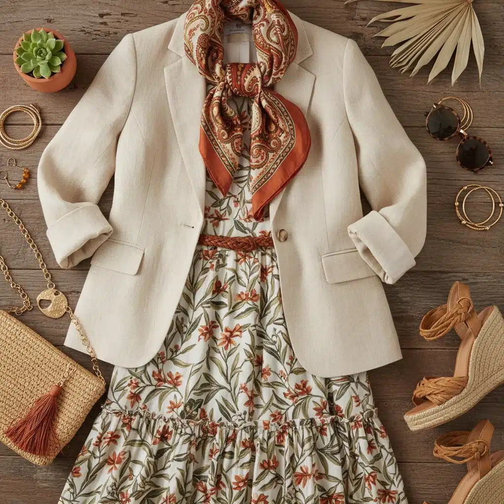
- Pick a Dominant Color: When wearing a patterned item, identify one or two dominant colors within the print. Then, choose solid pieces for the rest of your outfit that match these dominant colors.
- Mix Patterns (Carefully!): This is an advanced technique. For success, ensure one pattern is significantly smaller or larger than the other, or that they share a common color. For example, a pinstripe shirt with a large floral skirt, both incorporating navy.
- Neutral Grounding: Use a neutral piece to break up two bold patterns, or to provide a calm base for a busy print.
Understanding Your Personal Color Palette
Beyond general wardrobe color theory, knowing which colors best suit your individual complexion, hair, and eye color can elevate your style significantly. This is often referred to as ‘seasonal color analysis’ (e.g., Spring, Summer, Autumn, Winter types). While a professional analysis offers the most accuracy, you can experiment at home by holding different colored fabrics up to your face in natural light to see which ones make your skin look more radiant and your eyes sparkle.
The Role of Accessories in Color Theory
Accessories are not mere afterthoughts; they are crucial elements in applying wardrobe color theory. They can:
- Add a Pop: Introduce a vibrant color to a neutral outfit.
- Unify: Tie together disparate colors in an outfit by echoing one of the hues.
- Break Up: Create visual separation in a monochromatic look.
- Create a Focal Point: A statement necklace or a boldly colored belt can draw the eye and define your look.
Practical Application: Building Outfits with Confidence
Now that we’ve covered the theoretical aspects of wardrobe color theory, let’s look at how to put it into practice. The goal is to move beyond simply matching and start creating intentional, stylish ensembles.
Start with a Core Piece
When building an outfit, begin with one item you want to wear. This could be a new dress, a favorite pair of trousers, or a statement top. Then, use wardrobe color theory to select complementary pieces.
- Example 1 (Neutral Base): You want to wear your new camel-colored wide-leg pants.
- Option A (Monochromatic): Pair with an ivory silk blouse and beige loafers. Add a gold chain necklace for texture.
- Option B (Pop of Color): Pair with a cobalt blue knit sweater and brown ankle boots.
- Option C (Soft Contrast): Pair with a soft lavender ribbed tank and white sneakers for a casual, chic look.
- Example 2 (Vibrant Core): You want to style a bright emerald green midi skirt.
- Option A (Neutral Balance): Pair with a crisp white button-down shirt and black heels.
- Option B (Analogous Play): Pair with a teal blouse and navy pumps.
- Option C (Complementary Pop): Pair with a subtle red-orange patterned top (if the pattern is small) and nude sandals. Or, keep the top neutral and add red-orange earrings.
- Example 3 (Pastel Focus): Your new baby blue oversized blazer.
- Option A (Monochromatic Pastel): Wear over a lighter blue camisole with white jeans and silver accessories.
- Option B (Neutrals with Edge): Pair with a black turtleneck, black tailored trousers, and black loafers for a sophisticated contrast.
- Option C (Warm Pastel Mix): Layer over a cream-colored dress, complemented by nude heels.
Build a Capsule Wardrobe with Color Theory in Mind
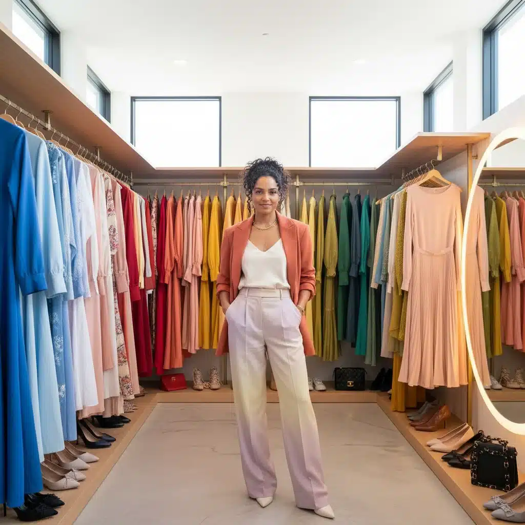
A capsule wardrobe is a curated collection of versatile pieces that can be mixed and matched to create numerous outfits. Applying wardrobe color theory to this concept makes it even more effective:
- Choose a Base Neutral: Start with black, navy, or gray as your primary neutral.
- Select Complementary Neutrals: Add white, beige, or brown to your base.
- Pick 1-3 Accent Colors: Choose colors that you love and that flatter you. Ensure these colors can be mixed with your chosen neutrals and ideally, with each other (e.g., analogous or complementary pairs).
- Focus on Versatile Pieces: Select tops, bottoms, and outerwear in your chosen colors that can be dressed up or down.
- Integrate Accessories: Use accessories to introduce additional pops of color or to reinforce your chosen palette.
This structured approach to wardrobe color theory ensures that every piece in your wardrobe works harmoniously, maximizing your styling options and minimizing decision fatigue.
Common Wardrobe Color Theory Mistakes to Avoid
Even with a good understanding of color theory, it’s easy to fall into common traps. Being aware of these pitfalls can help you refine your approach.
1. Overlooking Undertones
Colors have undertones (warm, cool, or neutral) that subtly influence how they look on you and with other colors. Mixing a cool-toned red (like a berry red) with a warm-toned yellow (like mustard) can sometimes clash. While not a strict rule, paying attention to undertones can create more cohesive looks, a deeper dive into wardrobe color theory.
2. Too Many Competing Colors
While triadic schemes can be vibrant, using too many highly saturated, contrasting colors in one outfit can look chaotic. If you’re using multiple colors, ensure one is dominant and the others are supporting accents, or use more muted versions of the colors.
3. Ignoring Contrast and Value
An outfit composed entirely of similar light or dark values can lack dimension. Introduce contrast through different shades, tints, or tones. For instance, a light pink top with dark red trousers creates more visual interest than a light pink top with light pink trousers (unless you’re intentionally going for a very subtle monochromatic look).
4. Forgetting the Impact of Fabric and Texture
The same color can appear very different in various fabrics. A shiny satin will reflect light differently than a matte wool. Texture adds visual interest and can soften or intensify a color. A bright red in a soft cashmere will feel different from the same red in a stiff leather, which is an important consideration in advanced wardrobe color theory.
5. Sticking Strictly to Rules
While color theory provides excellent guidelines, don’t let it stifle your creativity. Fashion is also about personal expression and breaking rules. Once you understand the fundamentals, feel free to experiment and develop your unique style. Sometimes the most impactful outfits come from unexpected combinations.
The Future of Wardrobe Color Theory in 2026 and Beyond
As we look to 2026 and beyond, wardrobe color theory will continue to be a dynamic and evolving field. Expect to see:
- Sustainability Influencing Palettes: A move towards natural dyes and earthy tones, alongside vibrant colors inspired by nature, reflecting a growing eco-conscious consumer base.
- Digital Color Integration: The influence of digital aesthetics and metaverse fashion potentially introducing new, unconventional color pairings and hyper-saturated hues into mainstream fashion.
- Fluidity and Gender-Neutral Palettes: A continued blurring of traditional gender lines in fashion, leading to more fluid and inclusive color palettes that appeal to a wider audience.
- Personalized Color Analysis: Advancements in AI and technology could make personalized color analysis more accessible, helping individuals discover their most flattering palettes with greater ease.
The core principles of wardrobe color theory will remain relevant, but their application will adapt to societal changes, technological advancements, and evolving aesthetic preferences. Staying informed and open to experimentation will be key to maintaining a fresh and modern style.
Conclusion: Your Journey to a Colorful, Confident Wardrobe
Mastering wardrobe color theory is not about following rigid rules; it’s about understanding a powerful tool that empowers you to make intentional and stylish choices. By grasping the basics of the color wheel, exploring the versatility of neutrals, embracing the energy of vibrant hues, and appreciating the sophistication of pastels, you’ve gained invaluable insights into transforming your personal style.
Remember, fashion is a journey of self-discovery and expression. Don’t be afraid to experiment, mix and match, and even break a few ‘rules’ once you understand them. Your wardrobe should be a reflection of your personality, your mood, and your aspirations.
Armed with this guide to wardrobe color theory for 2026, you are now ready to confidently curate outfits that not only look fantastic but also make you feel incredible. Step out, embrace color, and let your personal style shine!
What are your favorite color combinations? Share your wardrobe color theory tips in the comments below!